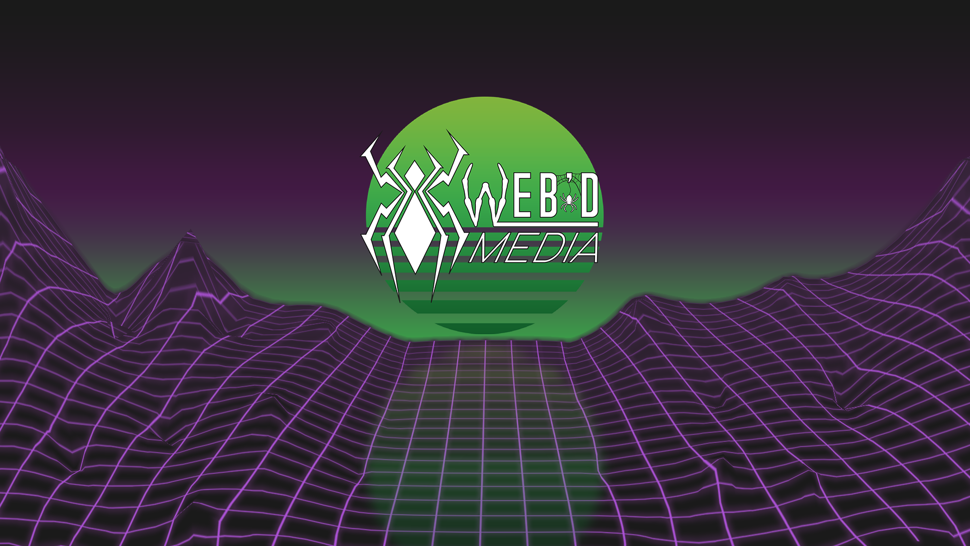
My Logo
When I first started my freelance business I was faced with a challenge every artist has had to face at one point in their life... who am I?...
Or at least who am I to my clients?
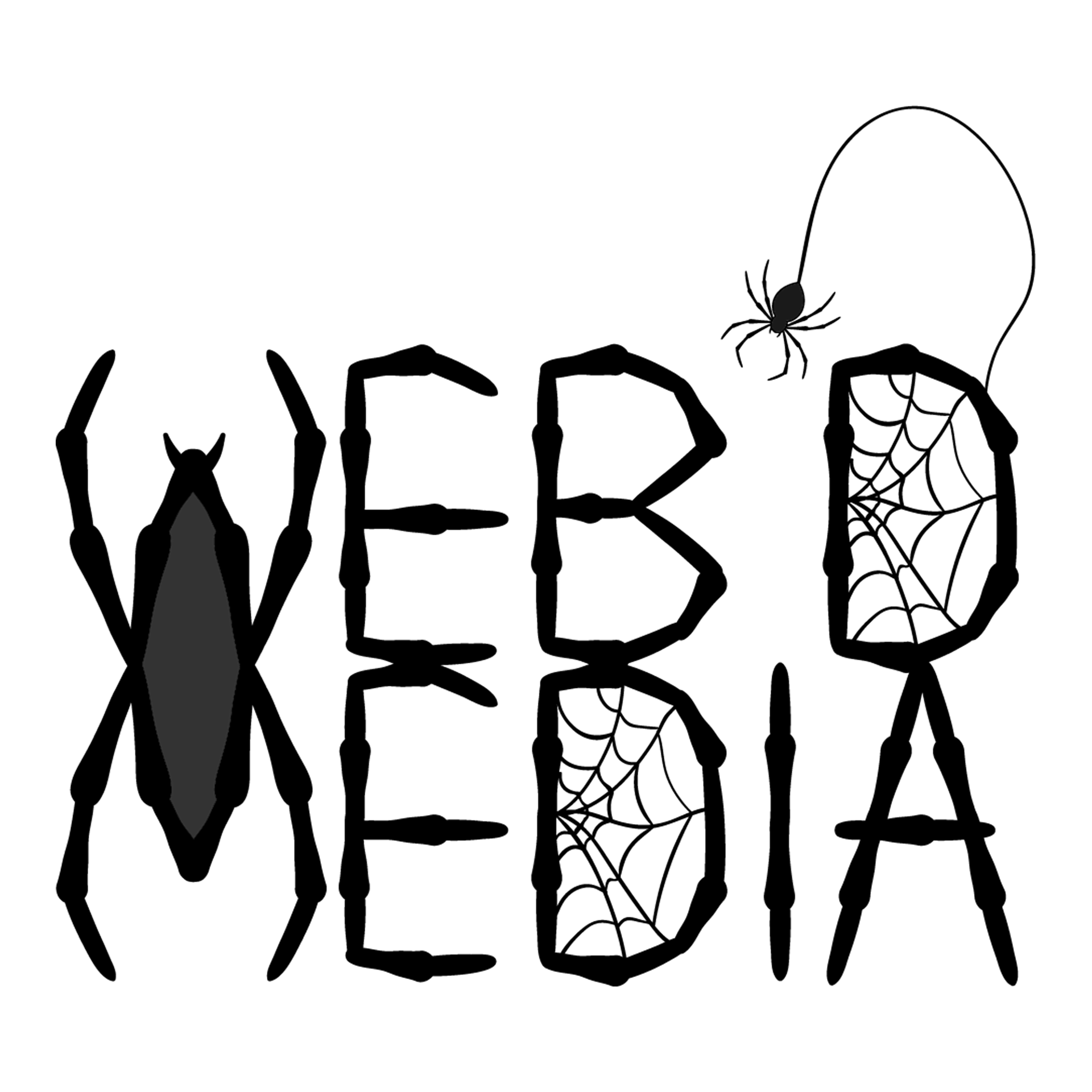
I first had to decide on a name/ identity. I didn't want to use my name as I was an excited budding graphic designer and felt a "company name" would be more exciting for branding reasons. So there I began to think, what do I call myself? well I wanted to create media, and I was specifically learning to create mostly digital media... I spent a long time trying to come up with something clever and then whilst swinging around New York in Spiderman PS4 (I'm a huge spidey fan can't you tell) it hit me. Web'd Media. Media that was for the Web
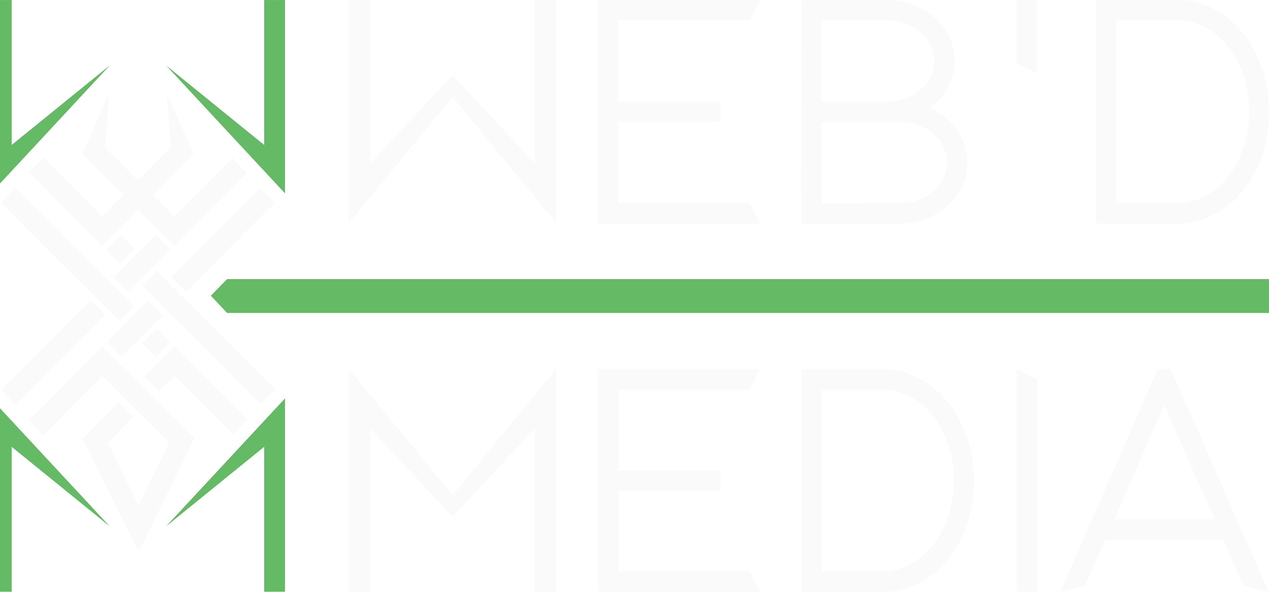
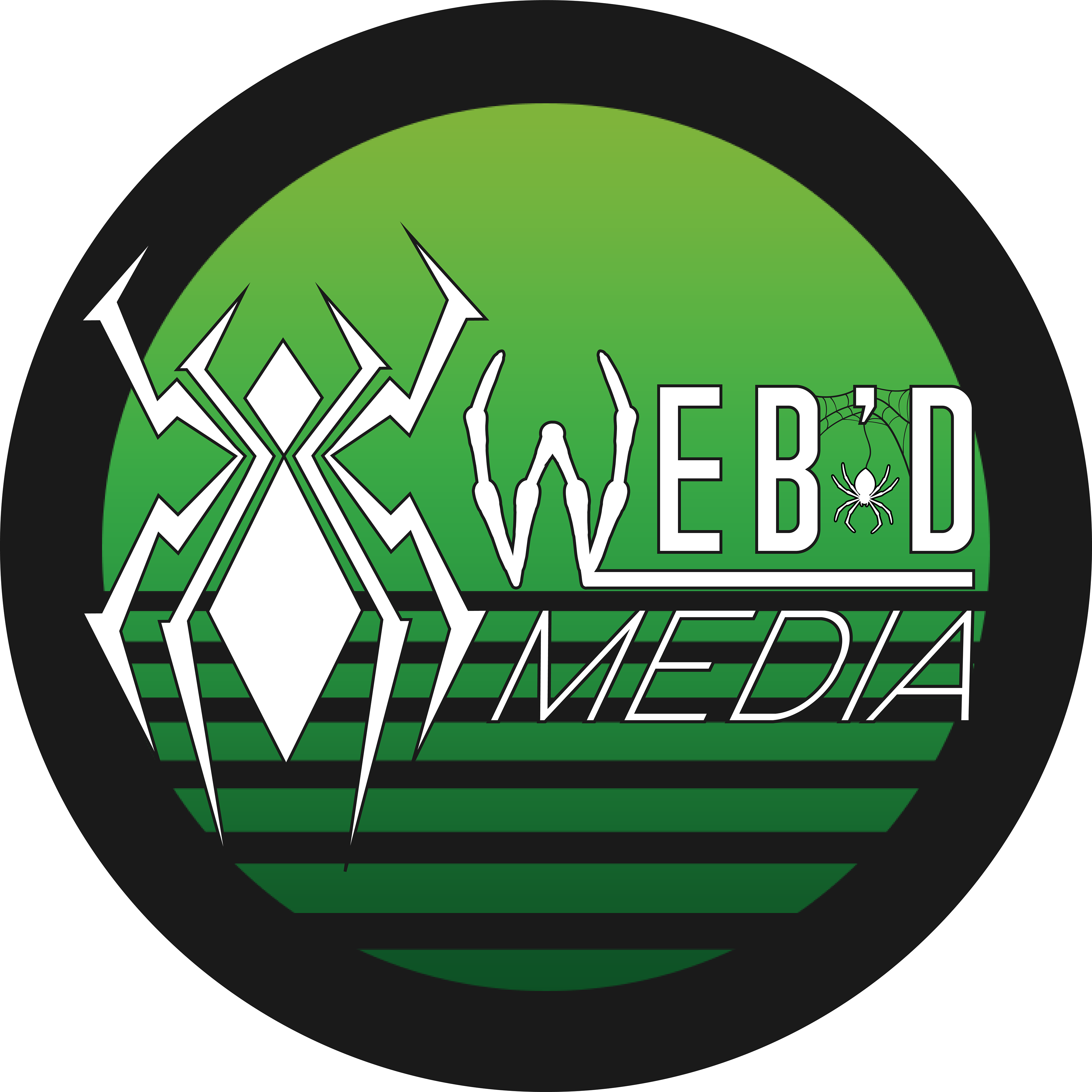
I immediately set about designing spider based logos and working to create an icon image for myself to the right is my first "official" logo I used to represent my business and below are some of my early ideas/ renditions.
To see an animated version of this logo click here and scroll down!
Discovering my identity (crisis)
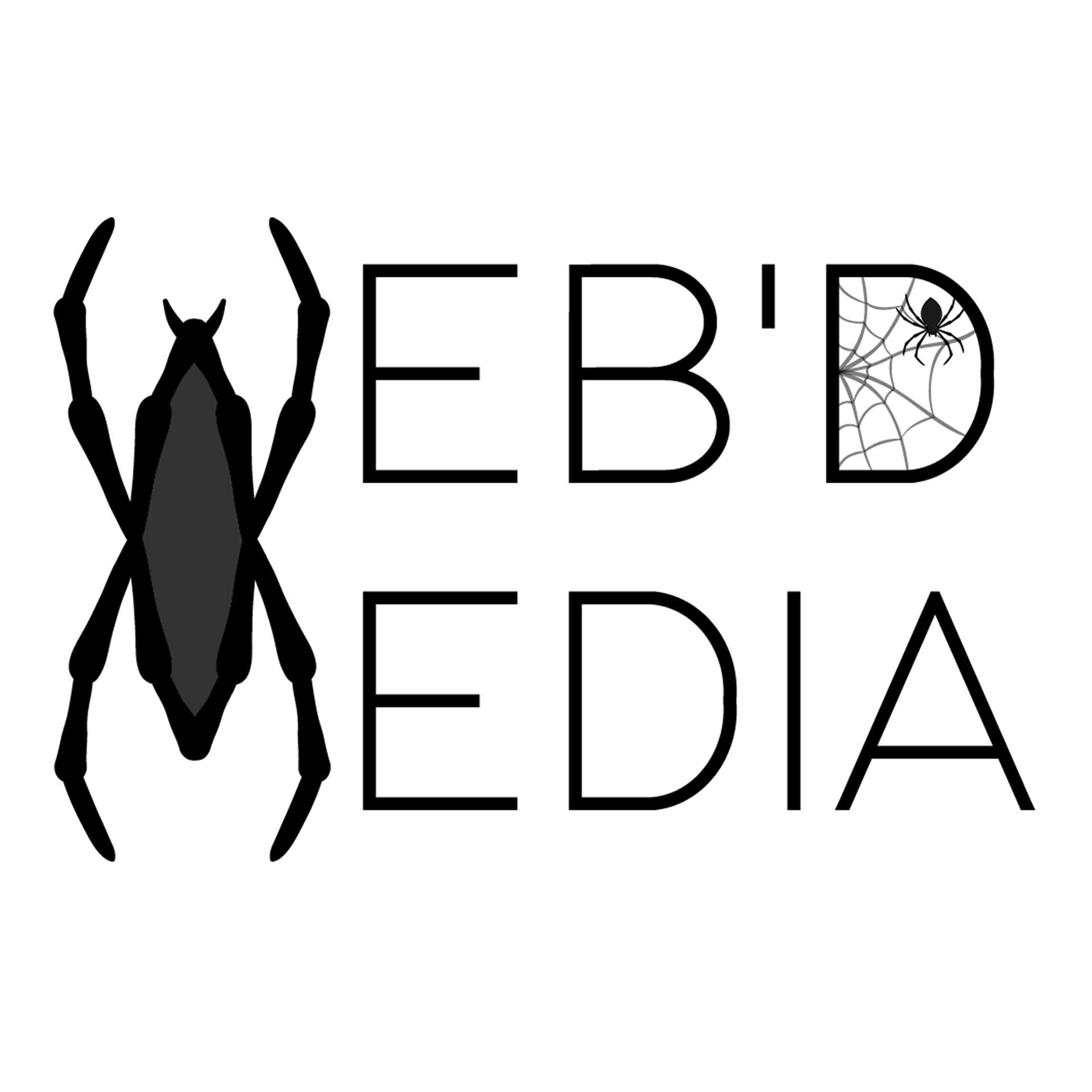
This first logo was the one I launched the business with and while I did like it, I felt I could do better. Below are some of the other designs I explored when settling on a logo, some of these designs never reached the light of day and some went of to replace my logo over the last couple years.
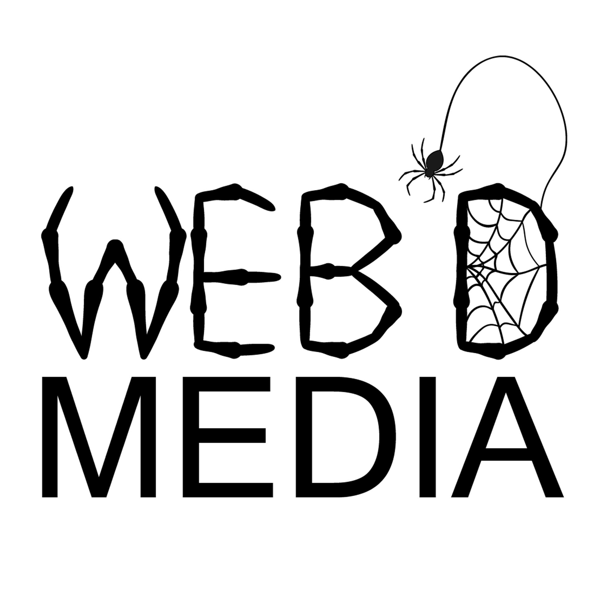
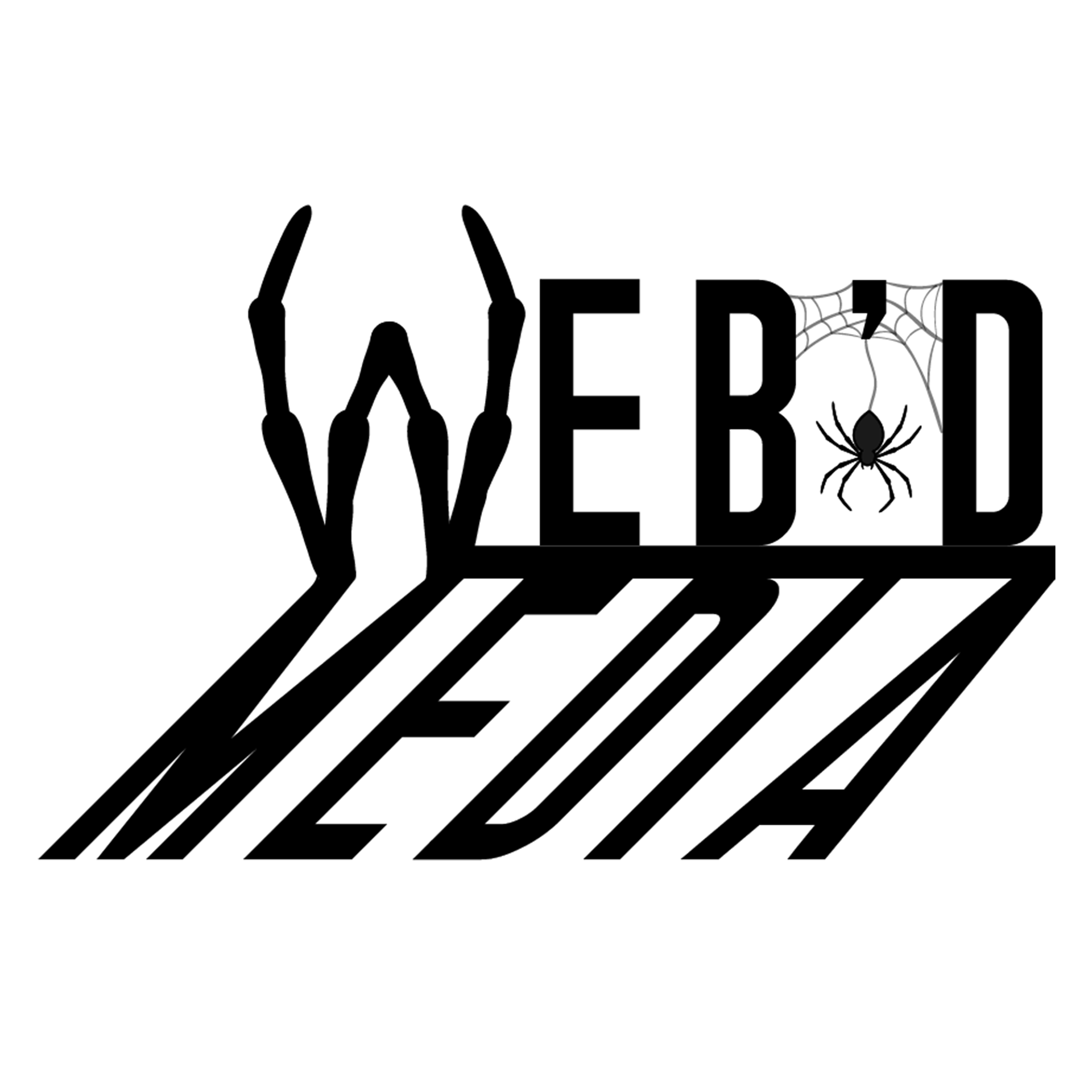
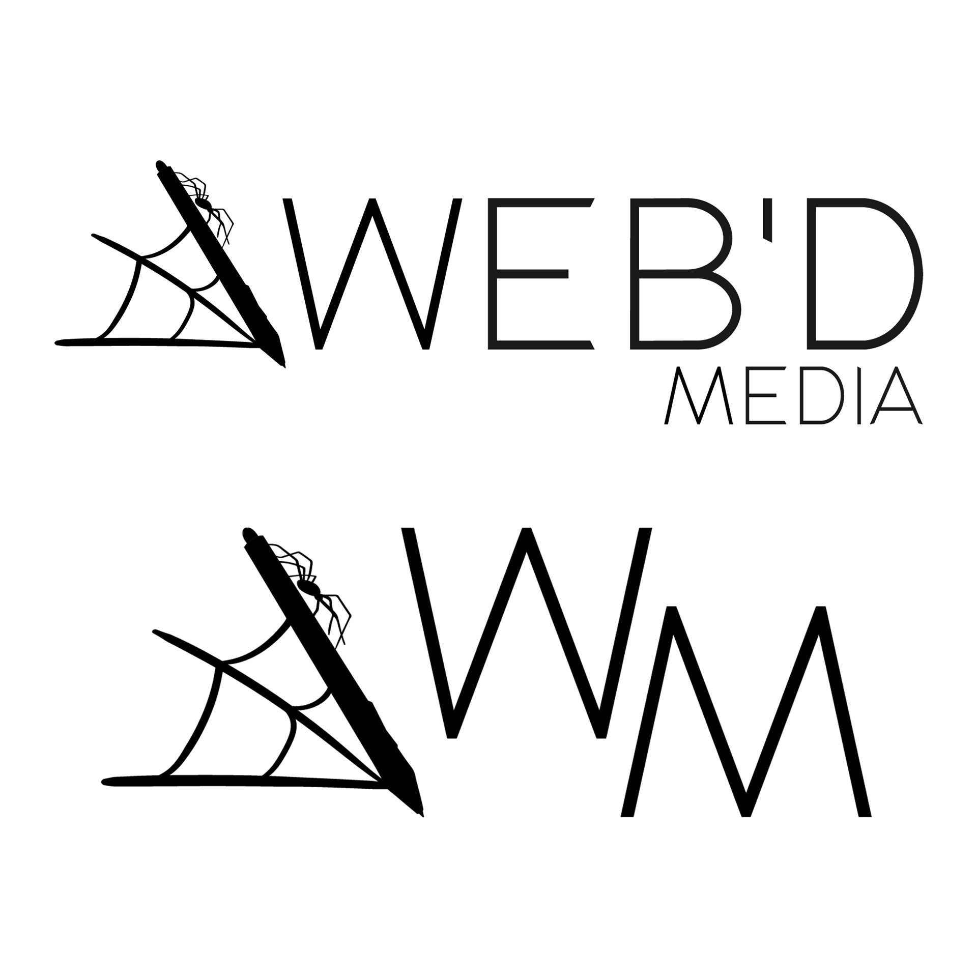
Digitiser pen logo
This was one of the earlier design explorations I did, while creating this one I was thinking about representing both the Web'd (the spider) and the Media (the digitiser pen) in the logo. I did like how this one turned out and looking at now on reflection it does have some potential. But I scrapped this design as I wanted a more Iconic symbol that could stand on its own without needing the full name.
It needs more... me
I decided to solve my logo issue by pivoting from thinking about representing my business and instead focussed on implementing my own style into the brand identity.
I did this as I was struggling on representing "design" with... well design, its like trying to describe the straight line without using the word "straight" or "line".
This resulted in me exploring more shapes and styles while I strove to find my "Iconic Spider" symbol.
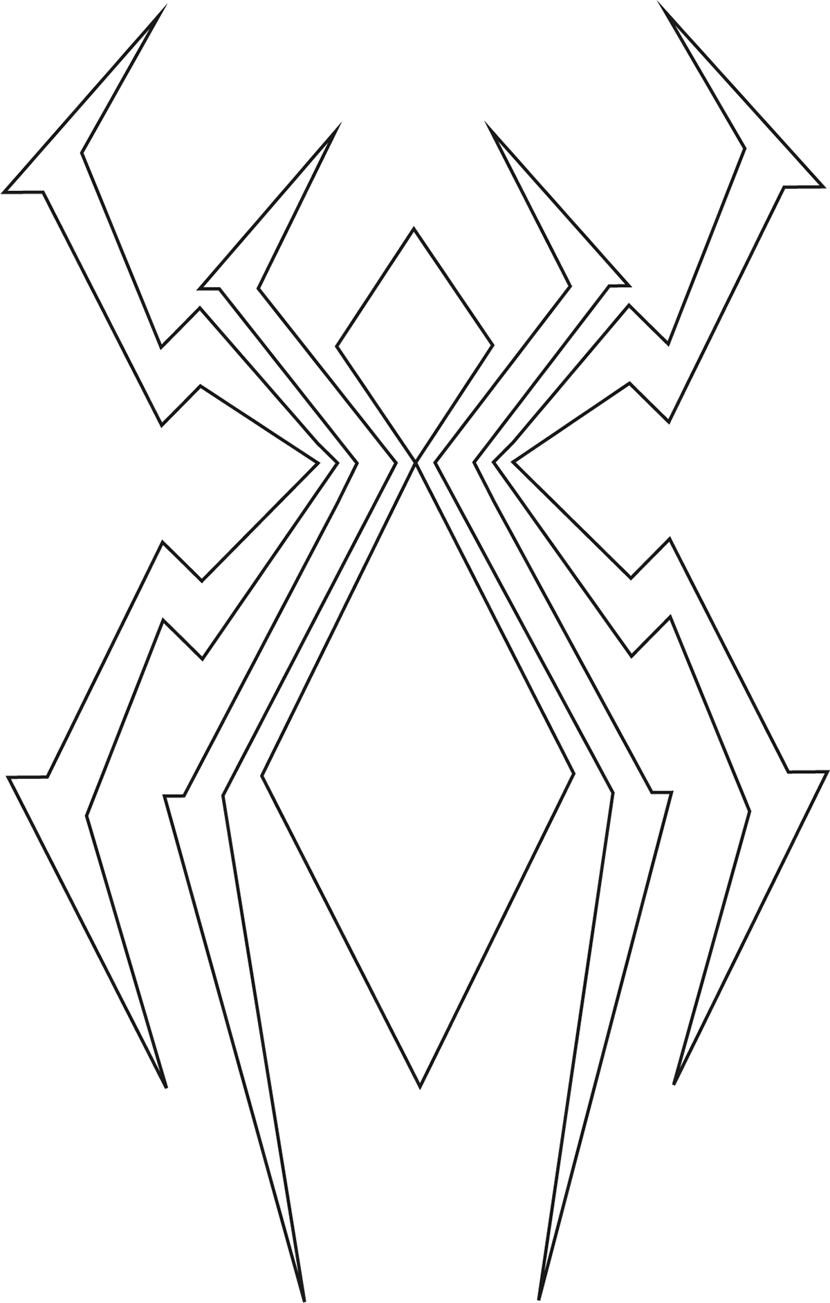
The geometric spider
Upon inward reflection I felt I wanted to look at taking my logo in a more modern, maybe even futuristic style, with harsh lines and sharp imagery.
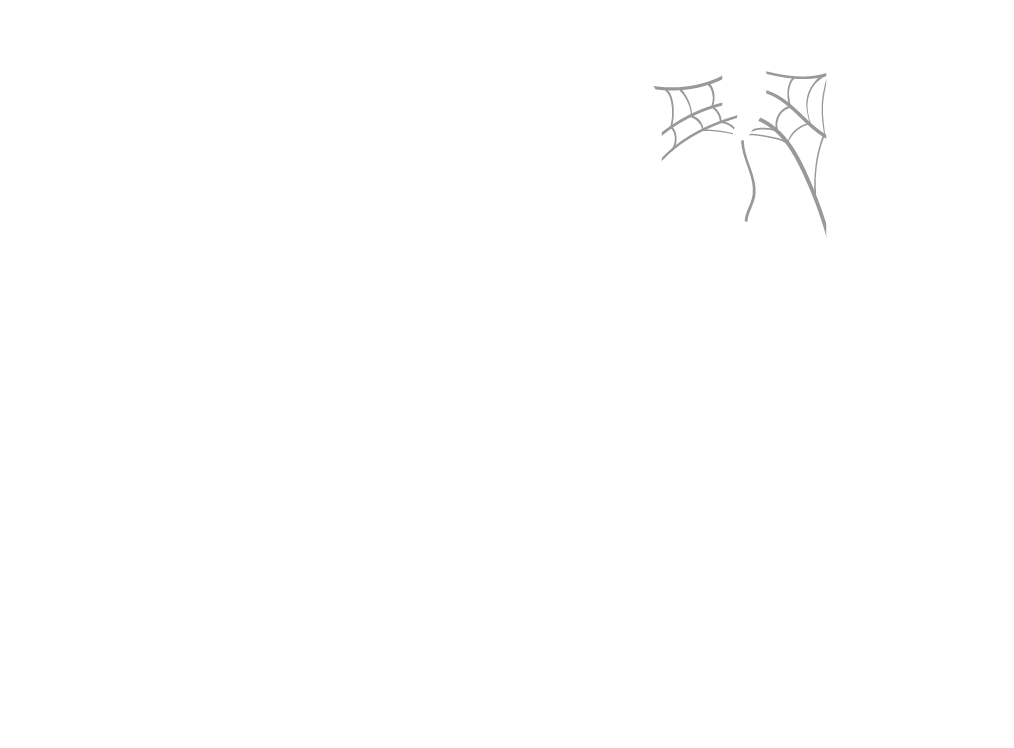
With this logo I found a pretty interesting spider shape that wasn't as off putting as the more realistic renditions in previous logos and one that could be used as a standalone icon. But I then struggled in incorporating the spider into the wood mark, which resulted in a logo that I'm not particularly proud of now. But this issue would lead to even worse logos...

It was just a phase....
I am not elaborating on this one... (I'm sorry)
Wait... this isn't me?
After exhausting my patience trying to make the geometric spider icon work in a word mark I decided to kill my darling, start fresh and rethink what I felt was authentically representing me and not a phase.
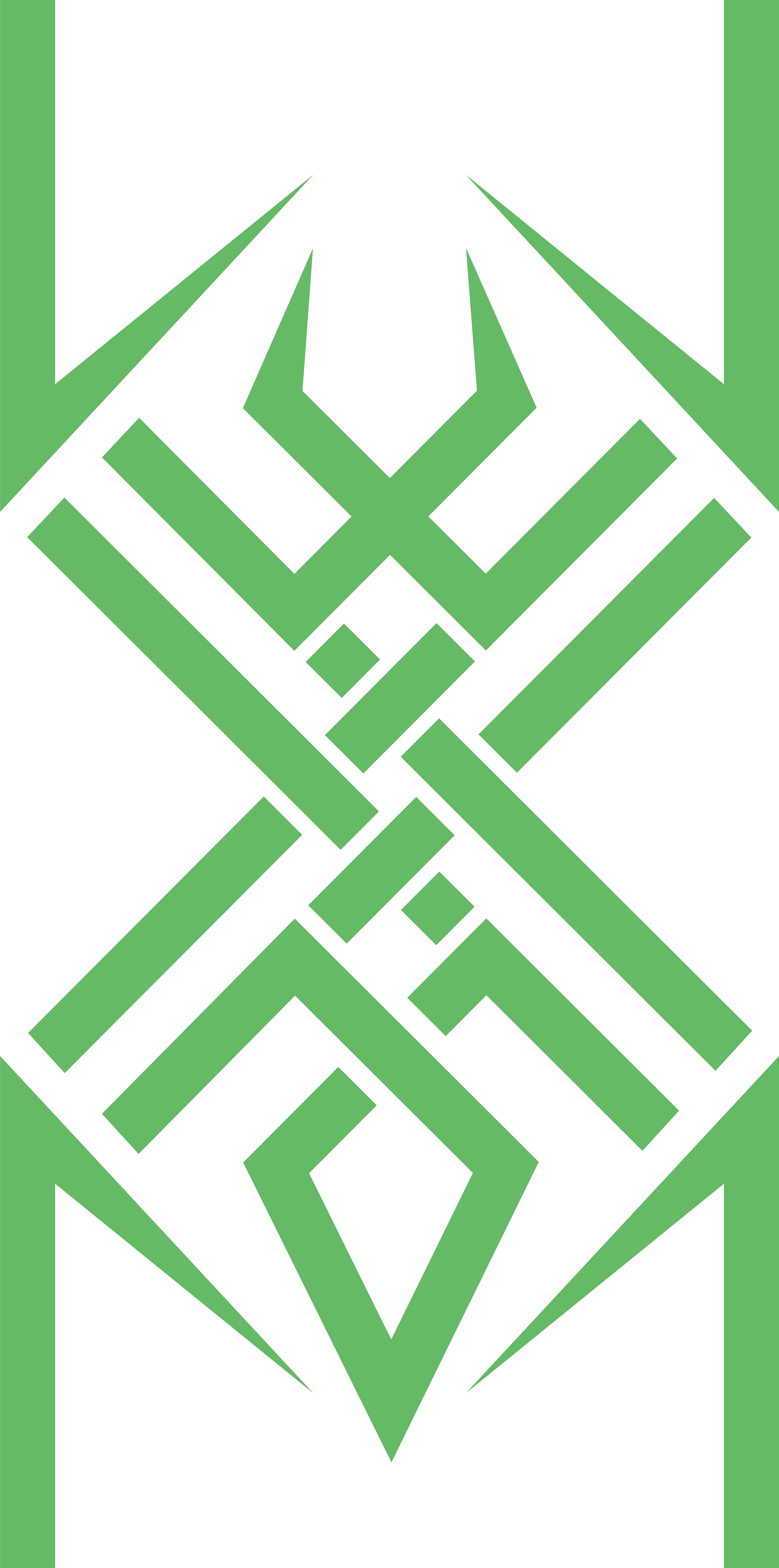
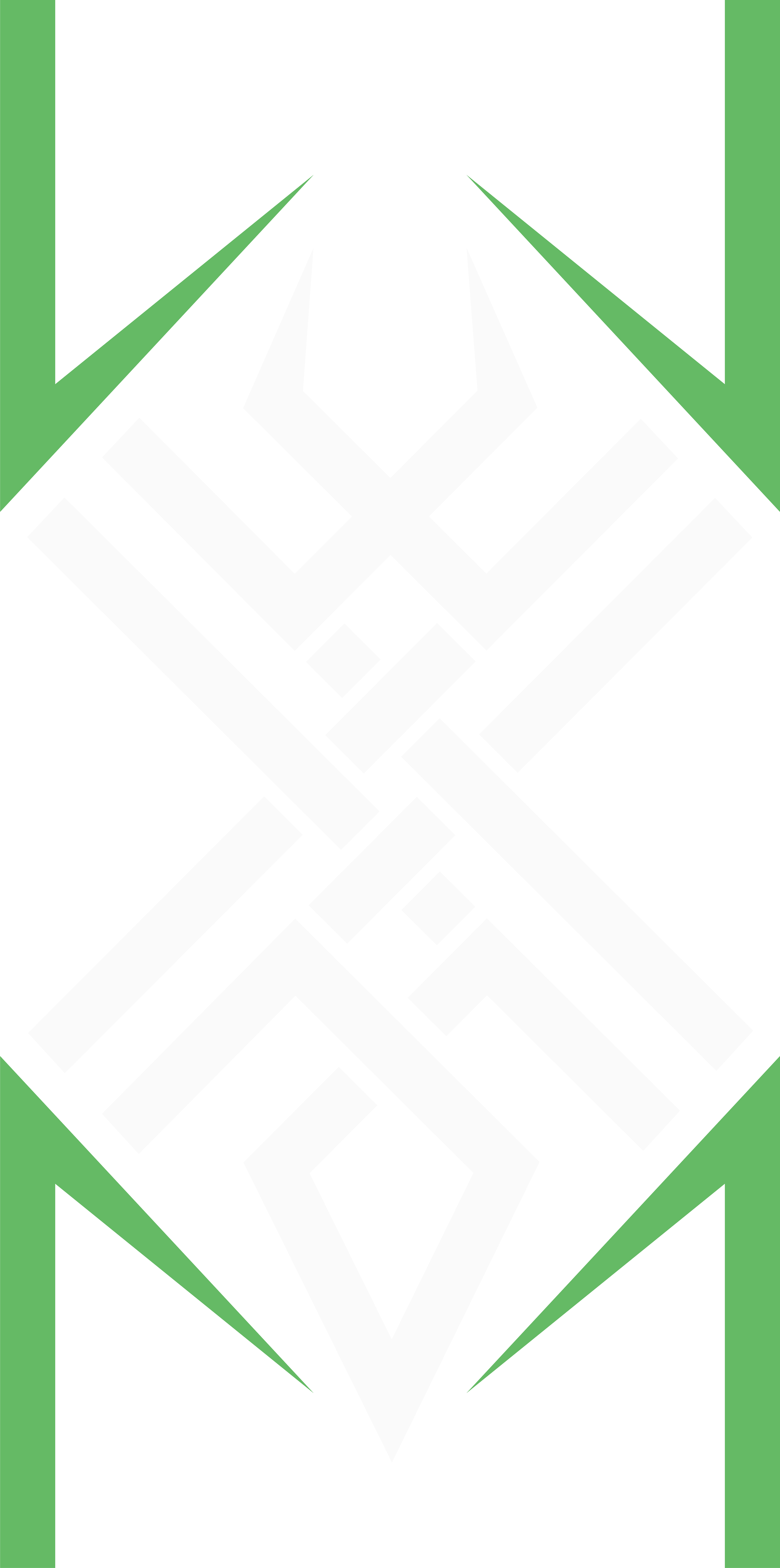
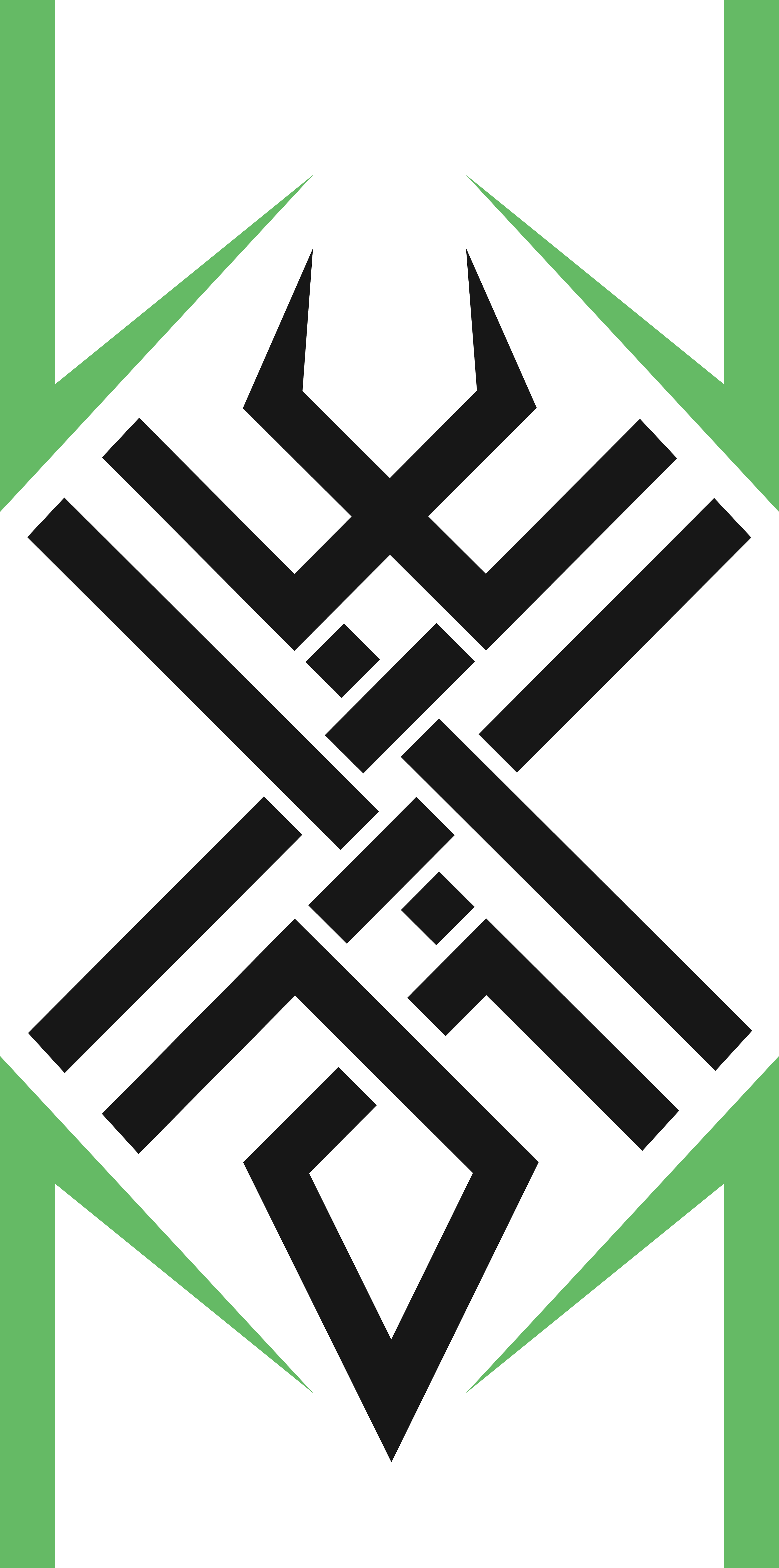
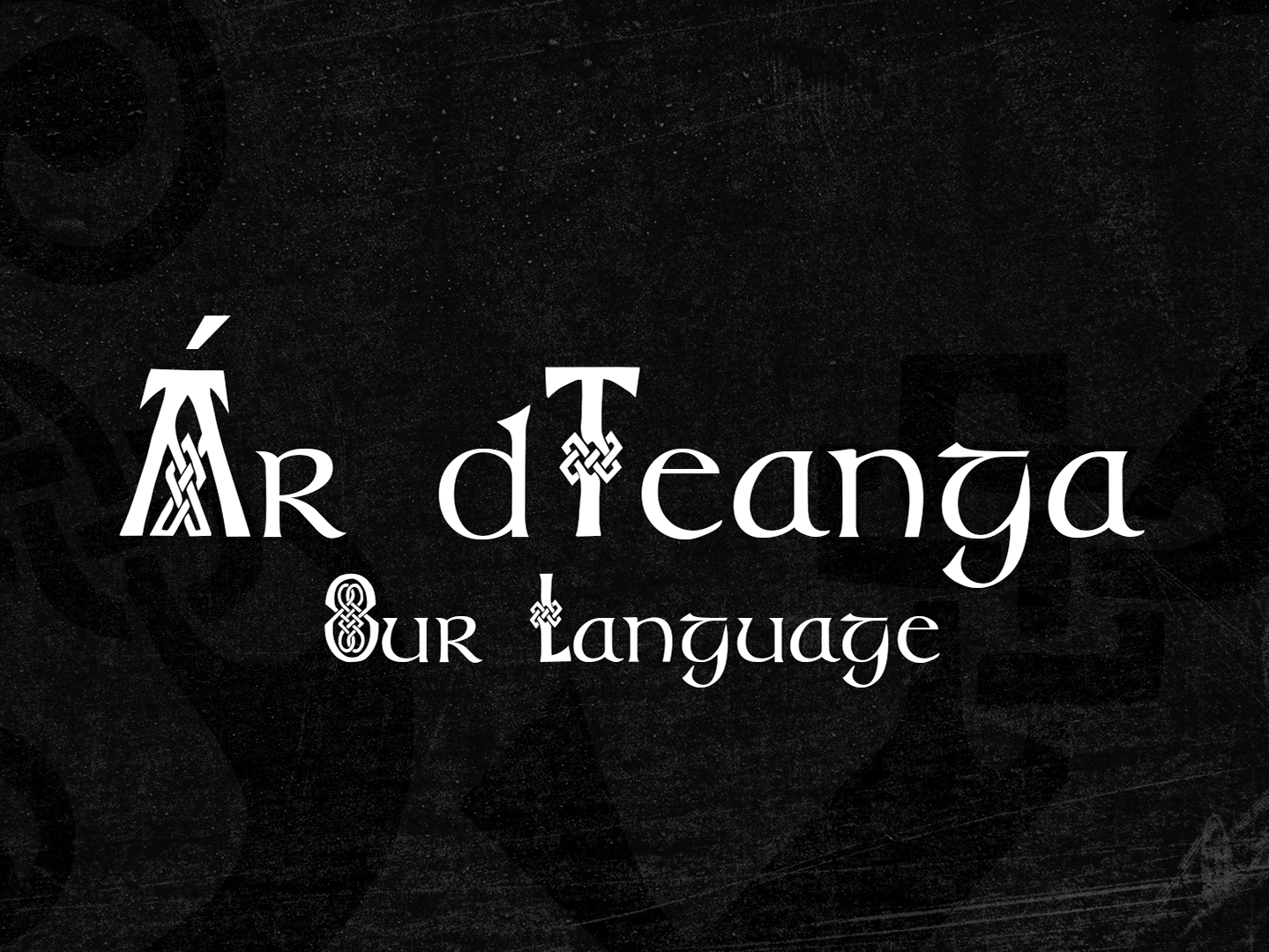
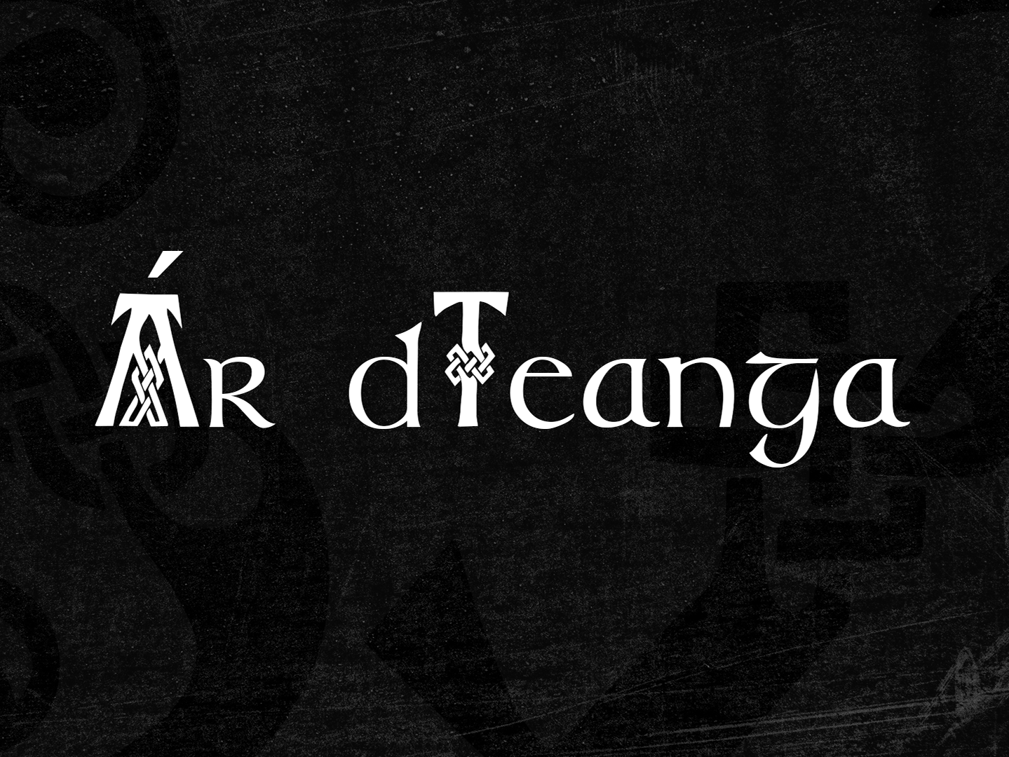
I decided to draw inspiration from my love of celtic knotwork. I felt it represented my taste as a designer and lent itself for some interesting shapes and most importantly, that spider icon I was after.
I liked designing the knotwork, I really enjoyed the spider icon and I loved that I could represent the WM for Web'd Media by changing the colour of the outer legs.
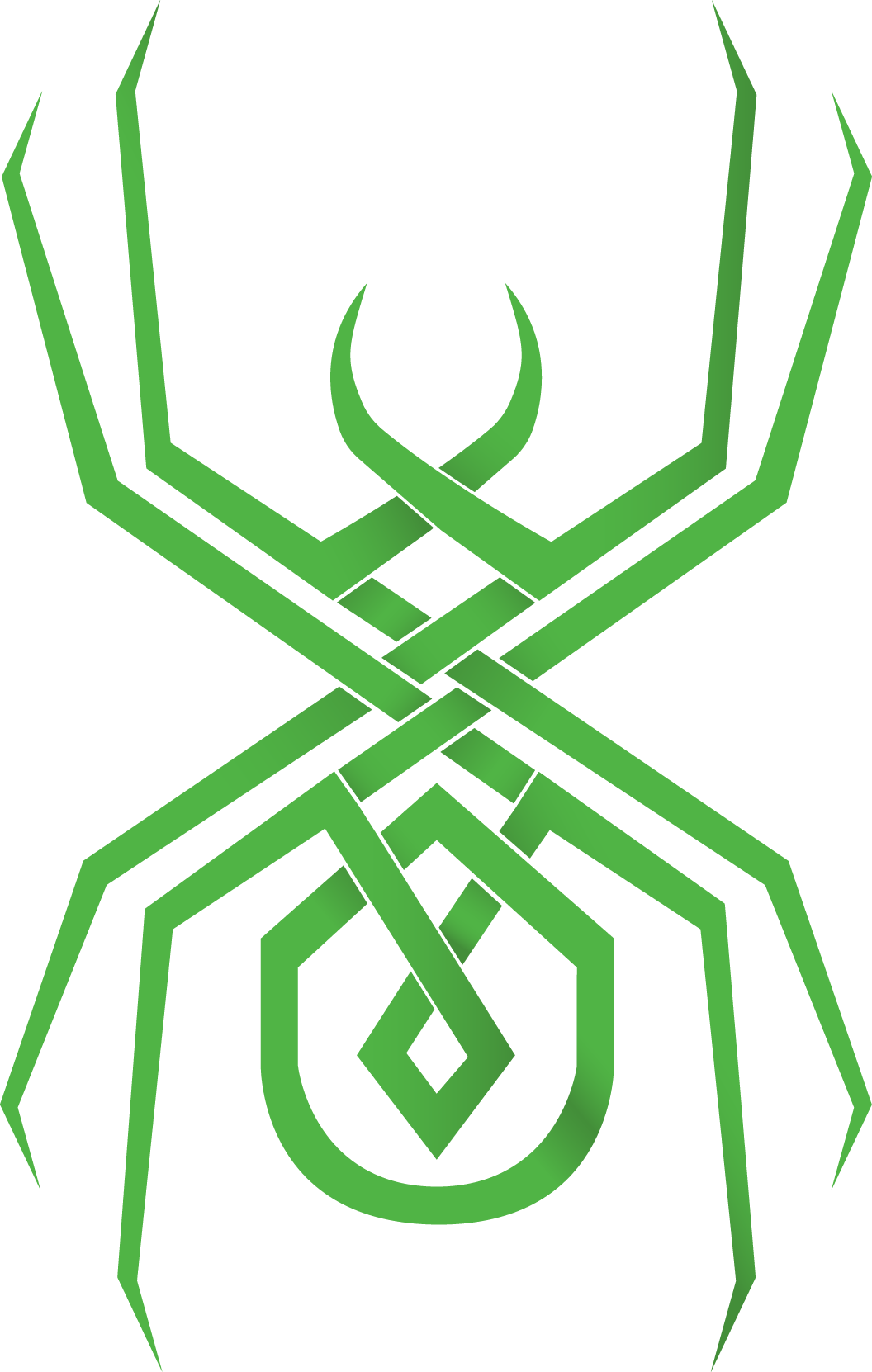

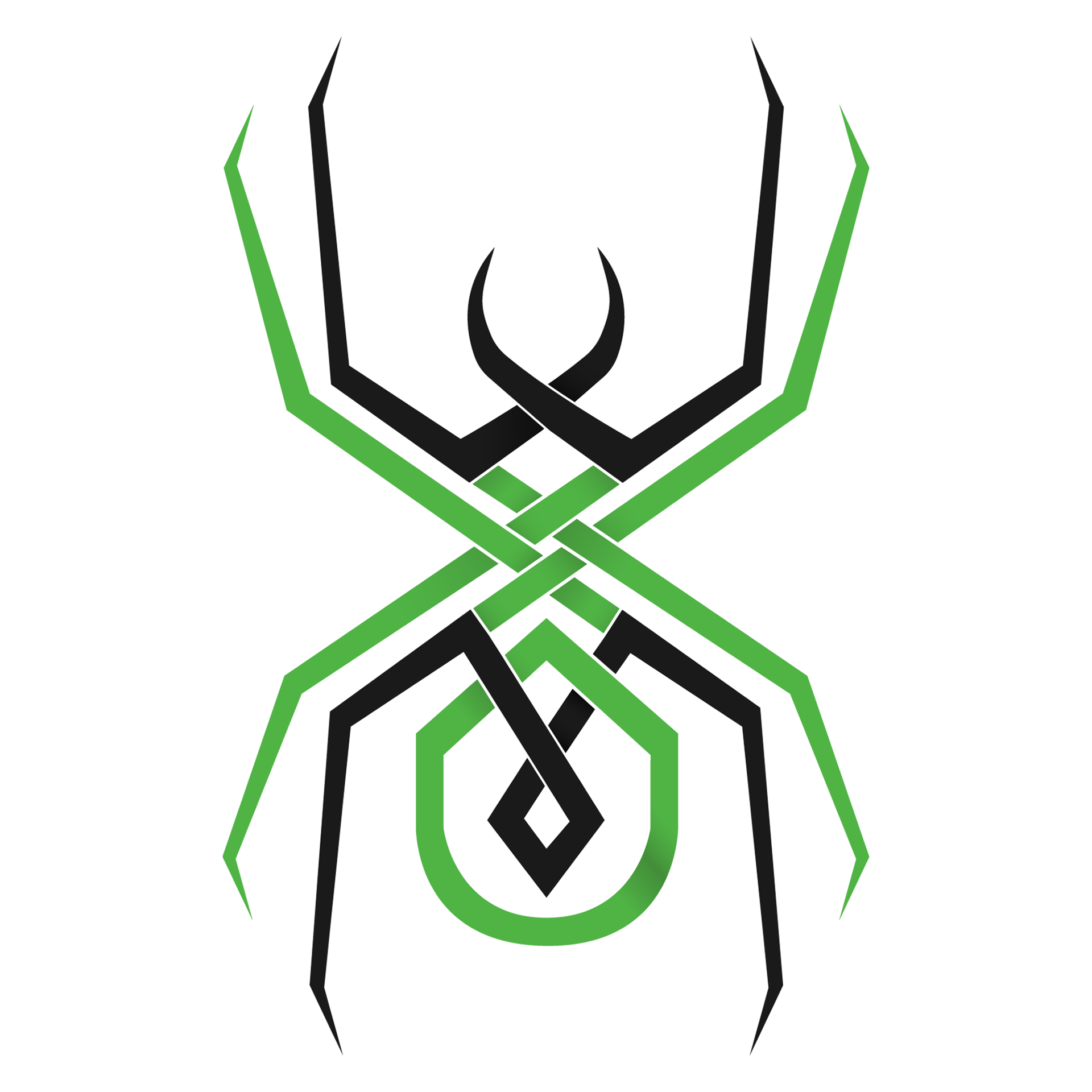
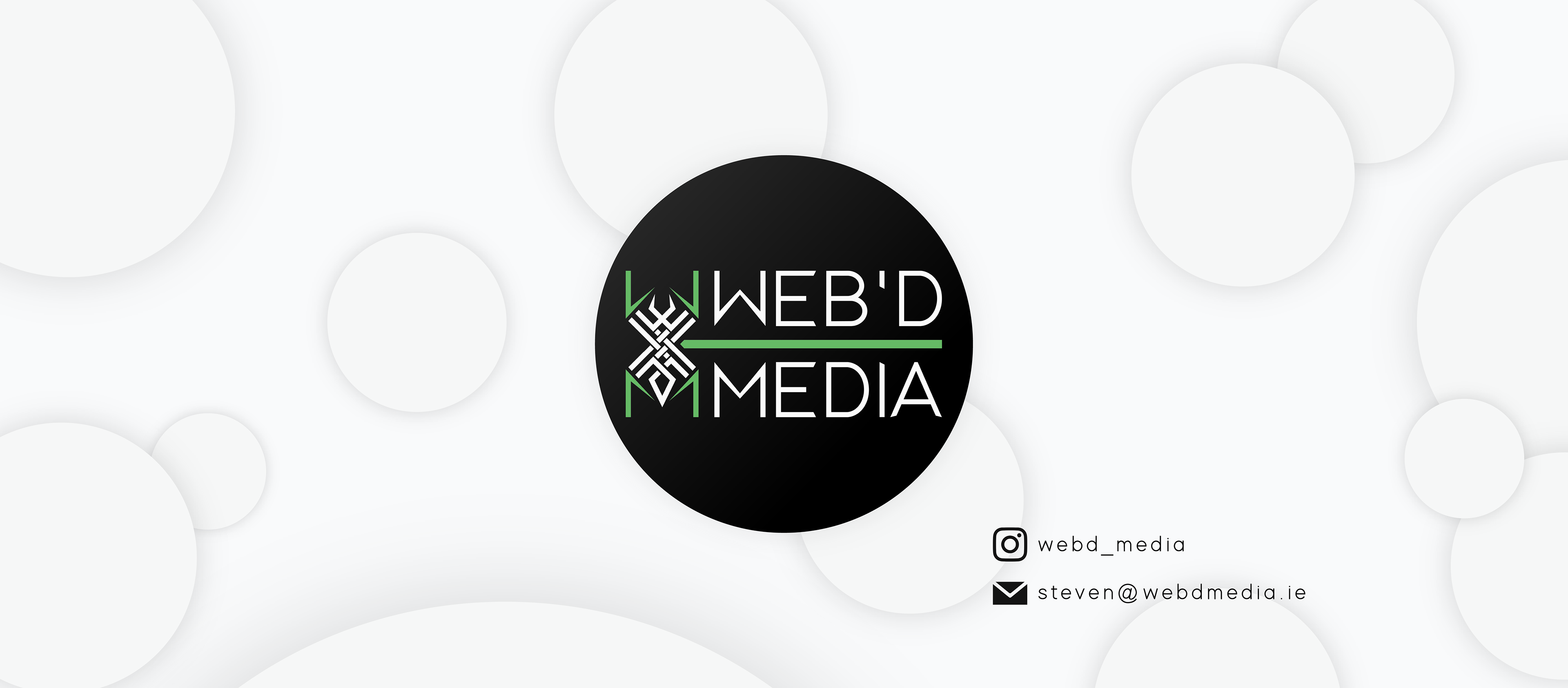
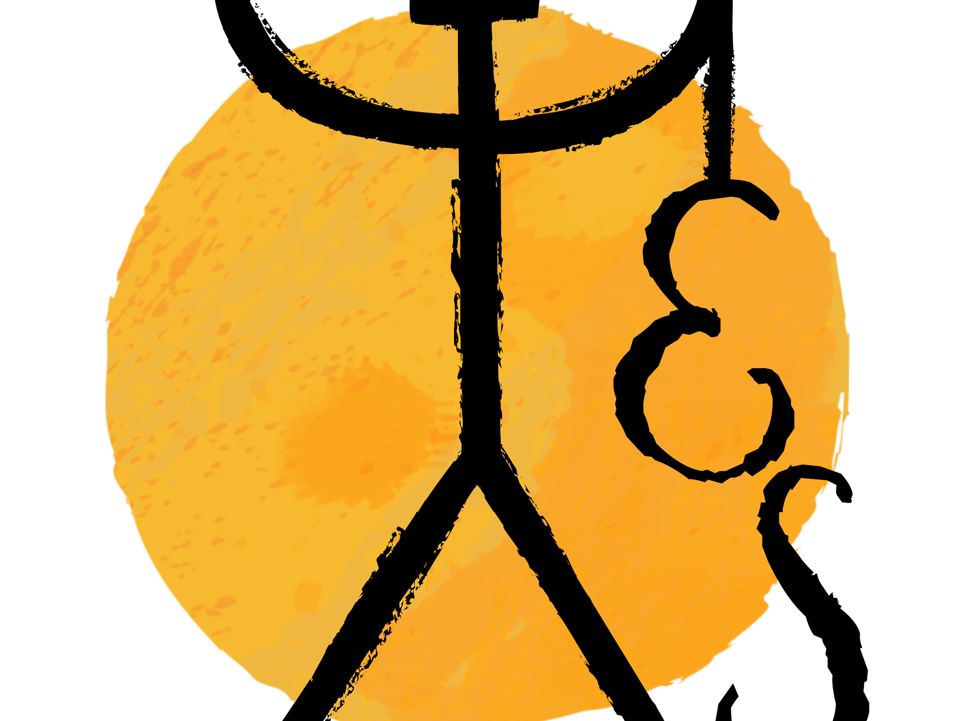
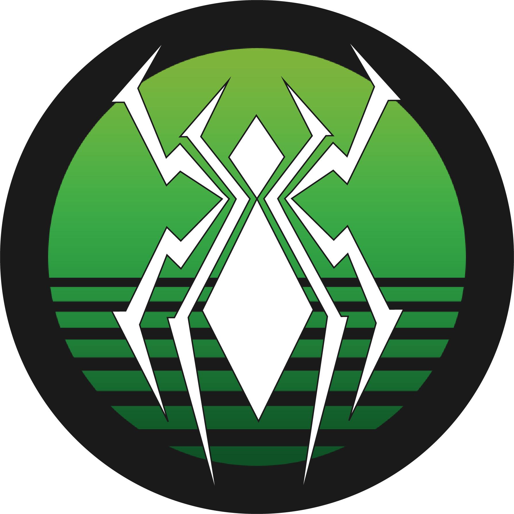
The Goldilocks Method
While I was really happy with where the logo had come I felt that it wasn't as clean looking as the older more modern logo. So I decided to try blend to the 2 styles and capture the bits that I liked from both. This lead me to my current logo, which I am quite happy with... at least for now...
With this logo I had my knotwork style, the harsh shapes and modern aesthetic and even the spider icon I craved (and it even has the WM thing I liked!)