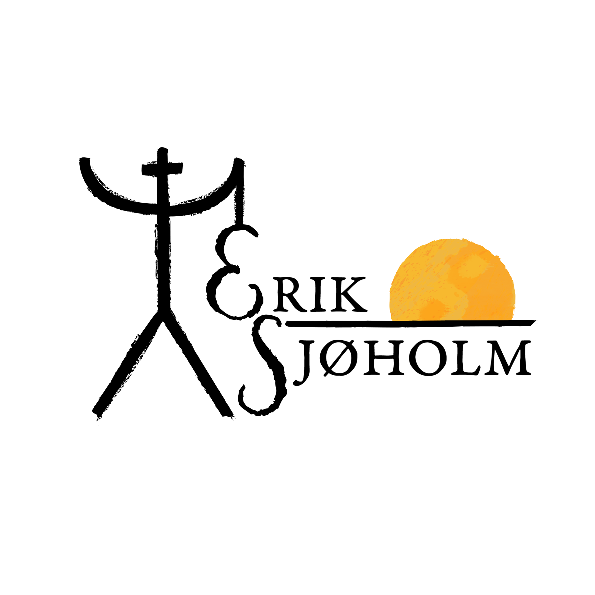
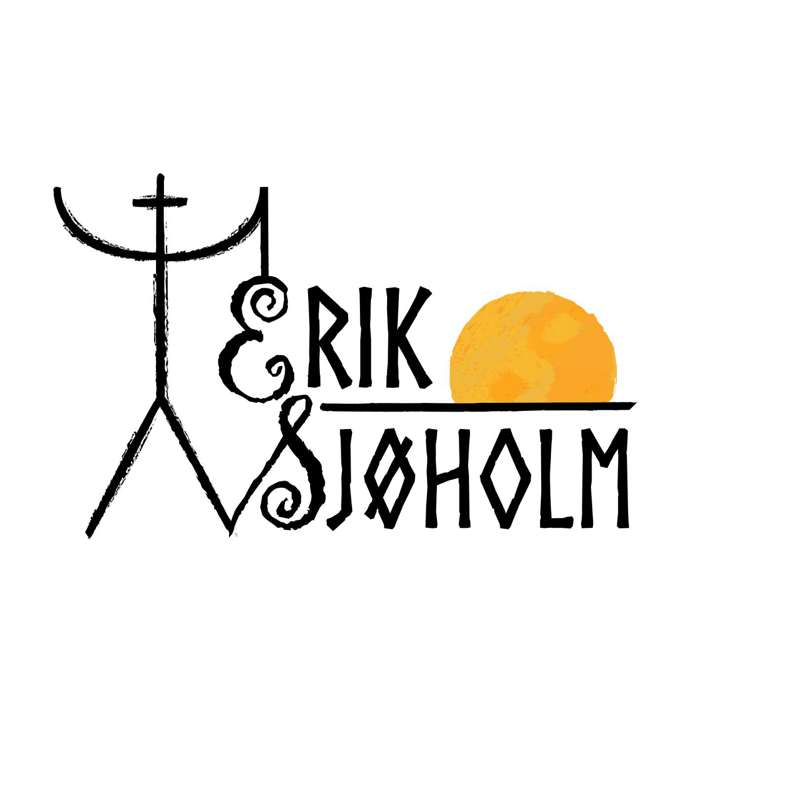
Erik Sjøholm
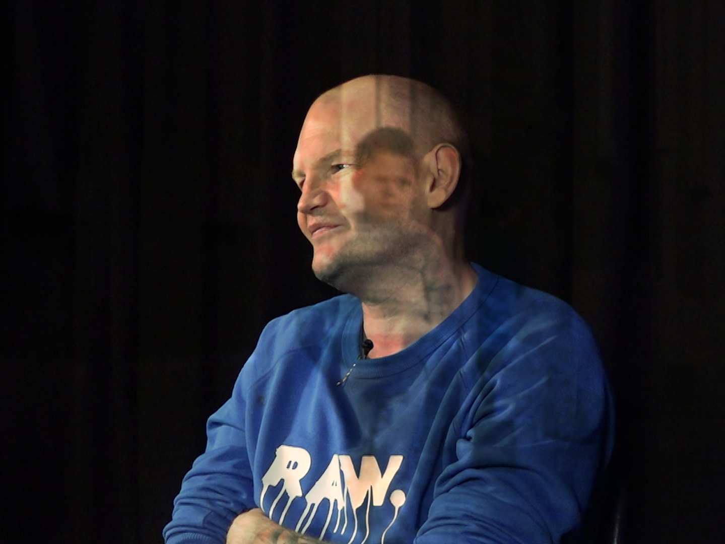
I worked with Finnish singer-songwriter & storyteller, Erik Sjøholm. Erik wanted a new logo to represent him and his journey. This was a particularly interesting project as Erik told me about his family symbol.
Erik wanted the logo to feel natural, down to earth and something that fit the energy of his music. He also wanted to incorporate his family symbol into the logo to represent himself and where he came from.
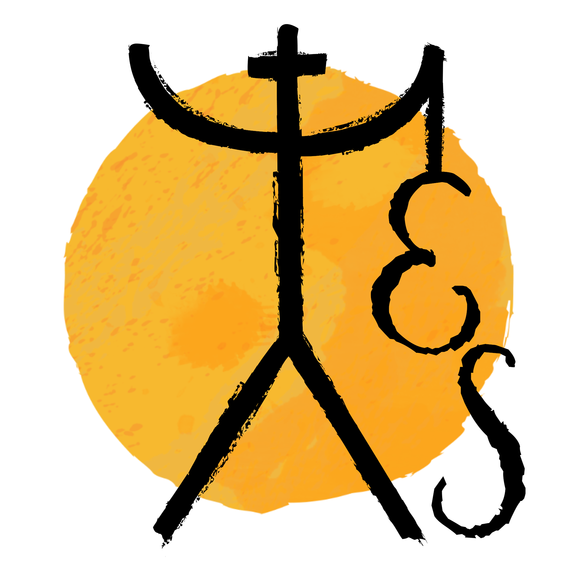
This lead us down some interesting explorations of the logo but ultimately deciding on a alteration of his family symbol that represents him holding his guitar, with the sun coming over the horizon to represent the start of his journey. The sun also has the Yin-Yang symbol to represent balance in his life.
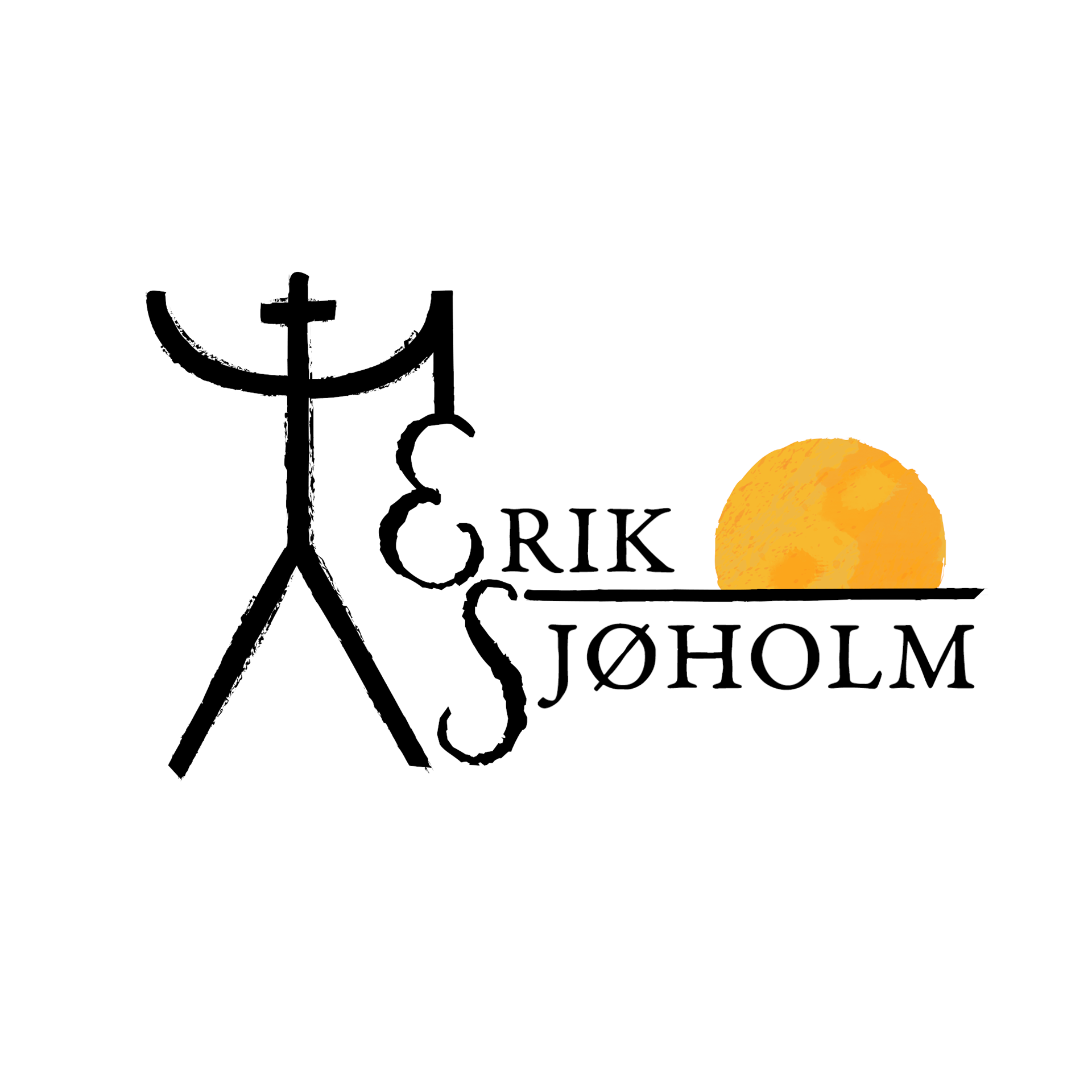
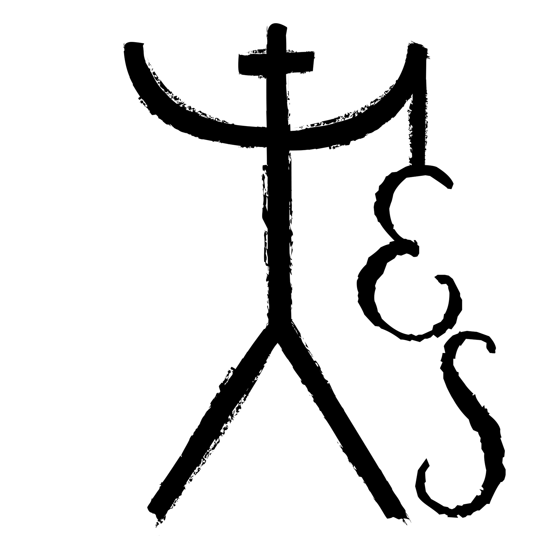
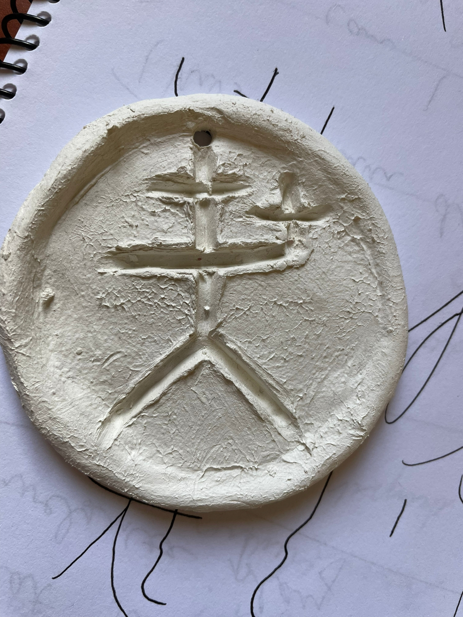
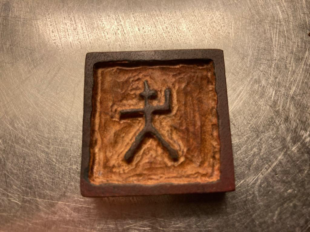
Sjøholm Family Symbol
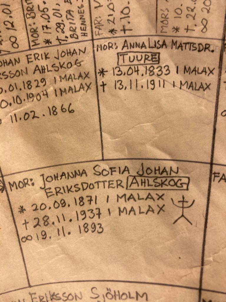
This is the family symbol Erik showed me, he told me the story of how his family were dairy farmers and to show who produce what, they would mark their produce with the family symbol. This was really interesting to me and I found it to be quite poetic that a symbol used to mark the family's work would be repurposed in a new era to mark Erik's work. It also really speaks to the idea of where you came from and where you are going.
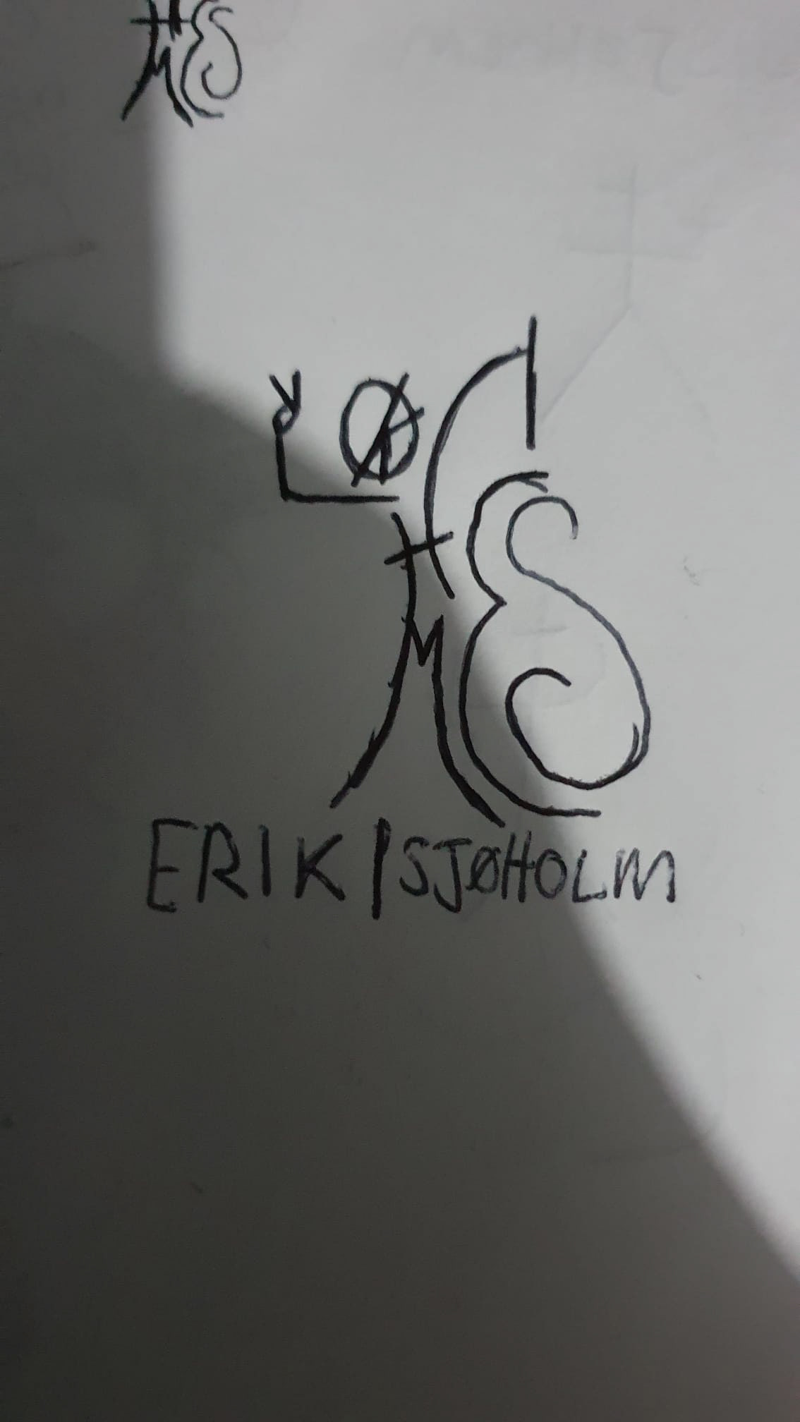
"Initial" Designs
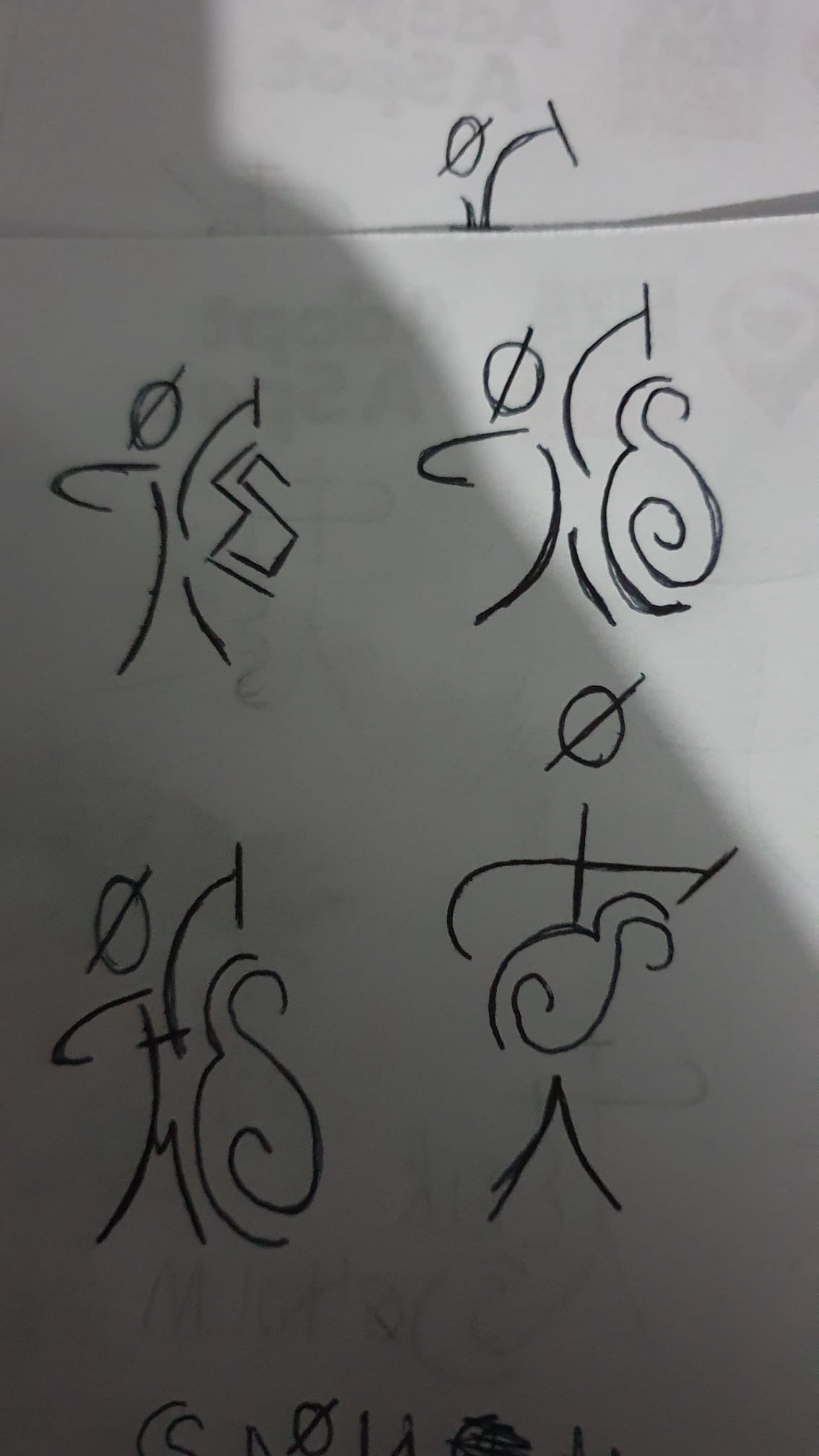
The first round of designs we tried some alterations on the man symbol concept, trying different lines and layouts to modernise the symbol. Erik wanted the logo to be similar to the old family symbol but with a rounded more friendlier feel.
I then had the idea of making up the guitar using Erik's initials "ES". This naturally progressed into working out how to create the man entirely out of the letters or Erik's name. While this did end up a little to convoluted and strayed too far from the original inspiration it was an interesting exercise.
Getting back to roots
I then looked back at the original family symbol and began working on some alterations closer to the original. Upon further exploration I came up with these designs. During this stage of design Erik also shared that his mum poses for photographs with her hands in the air and he has adopted this pose into his shows, he felt it was fitting that the logo reflected this (even if it was a coincidence)
During this round of designs we began discussing the ideas of adding the sun and Yin-Yang symbol into the logo.
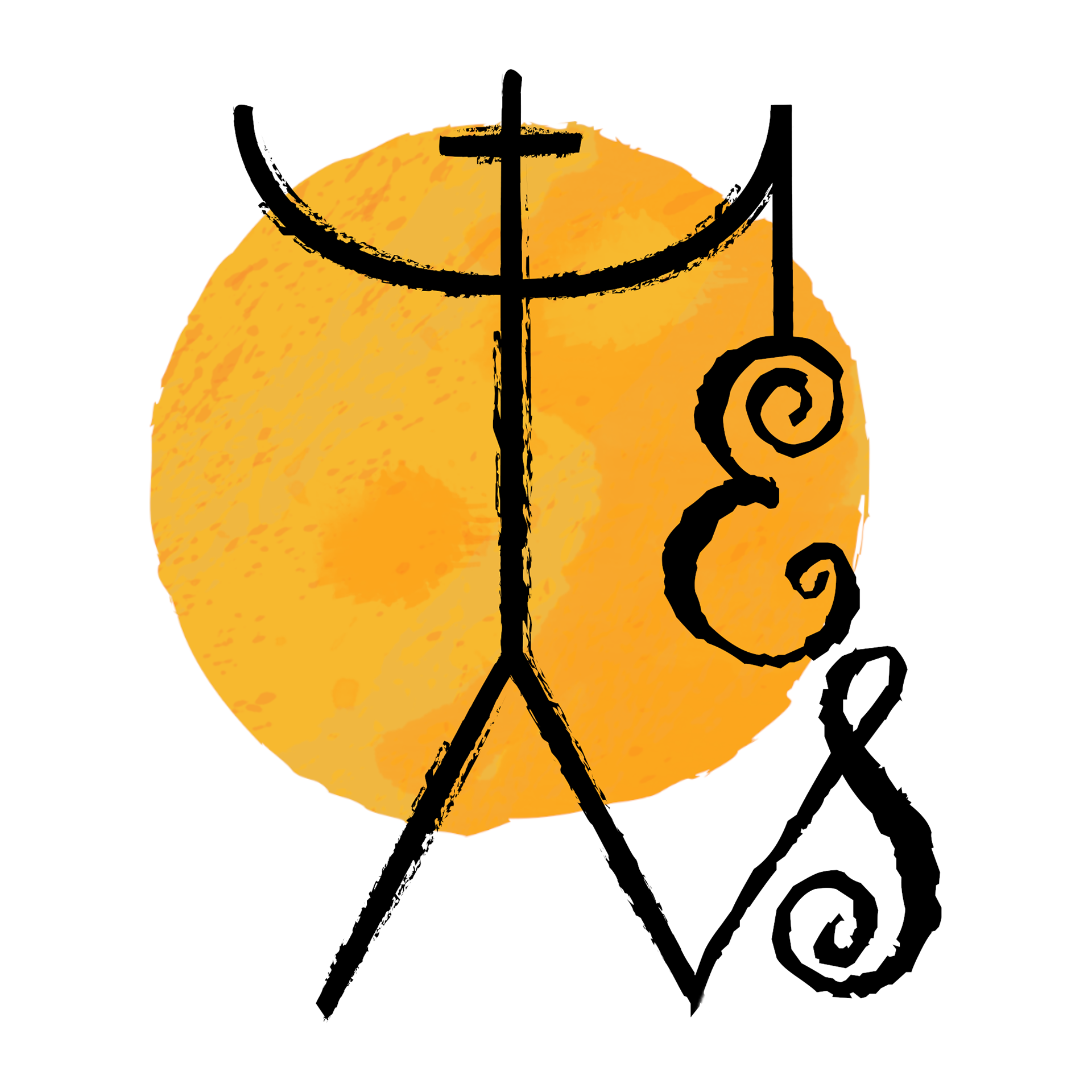
Logo Refinements
From here we talked through some last minor adjustments, thickening up the lines and adjusting the proportion of the limbs to more closely match the original symbol, changing the font to be more reflective of Erik's music and removing the spirals to give the symbol a more authentic and classic look. All these refinements lead to the final logo.